Pump.fun
Fair launch energy. A visual identity that feels immediate, recognizable and easy to share.
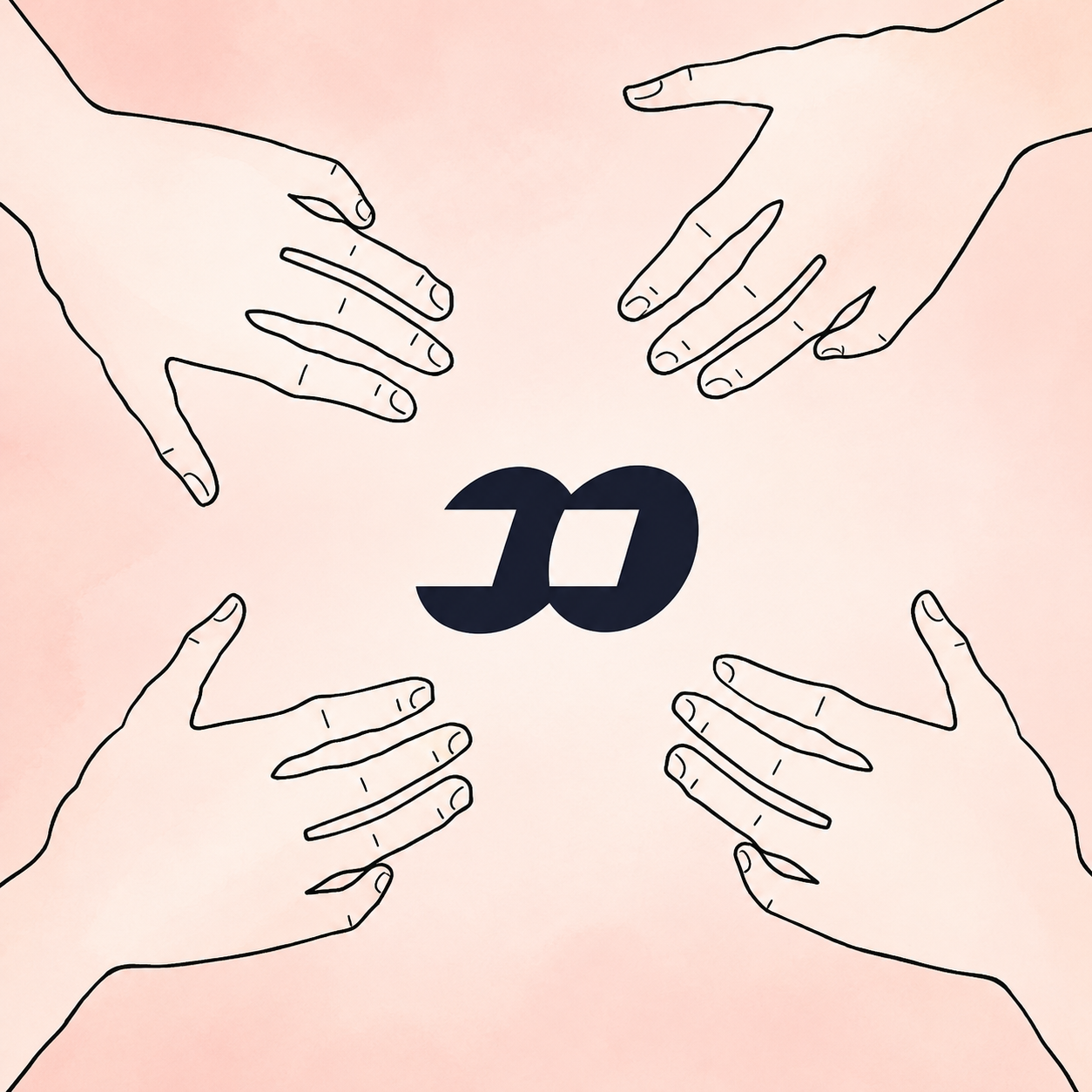
A clean, hand-drawn world built around one simple feeling: everyone reaches for the same moment before it disappears.
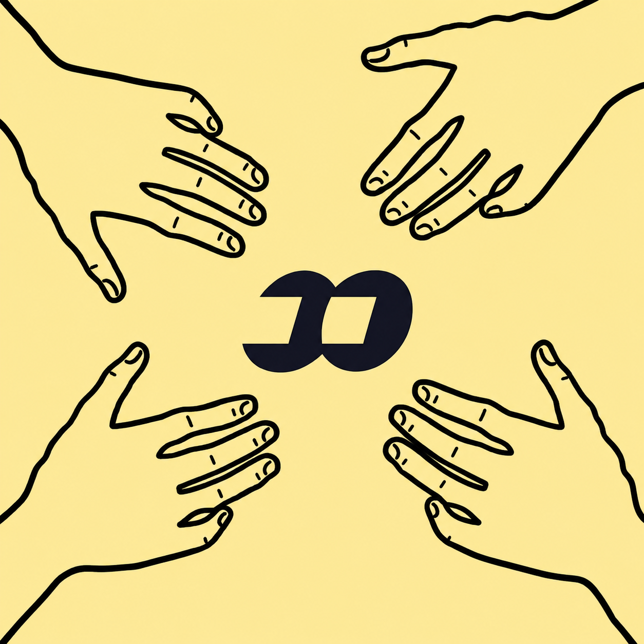
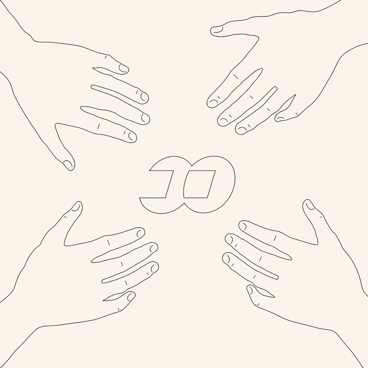
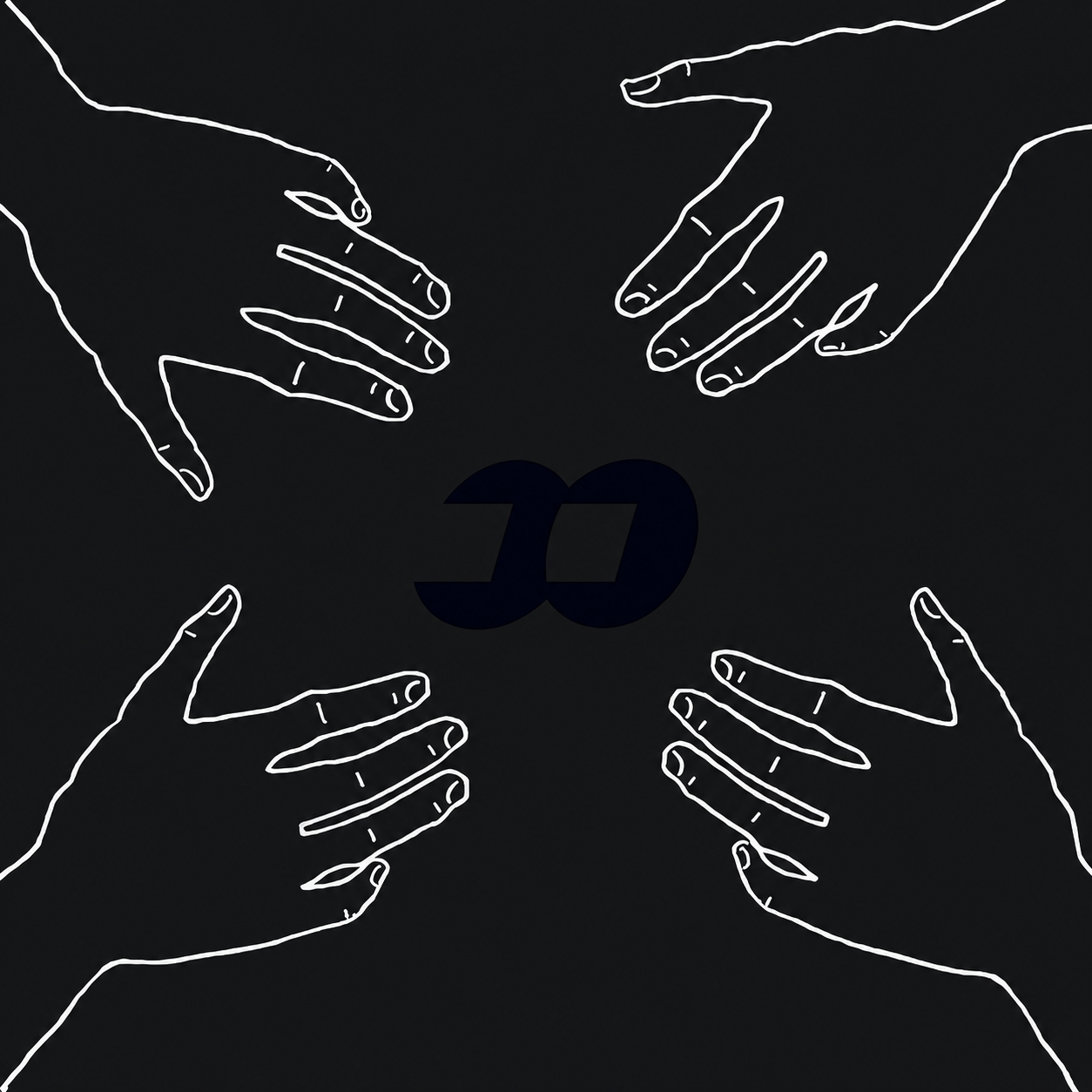
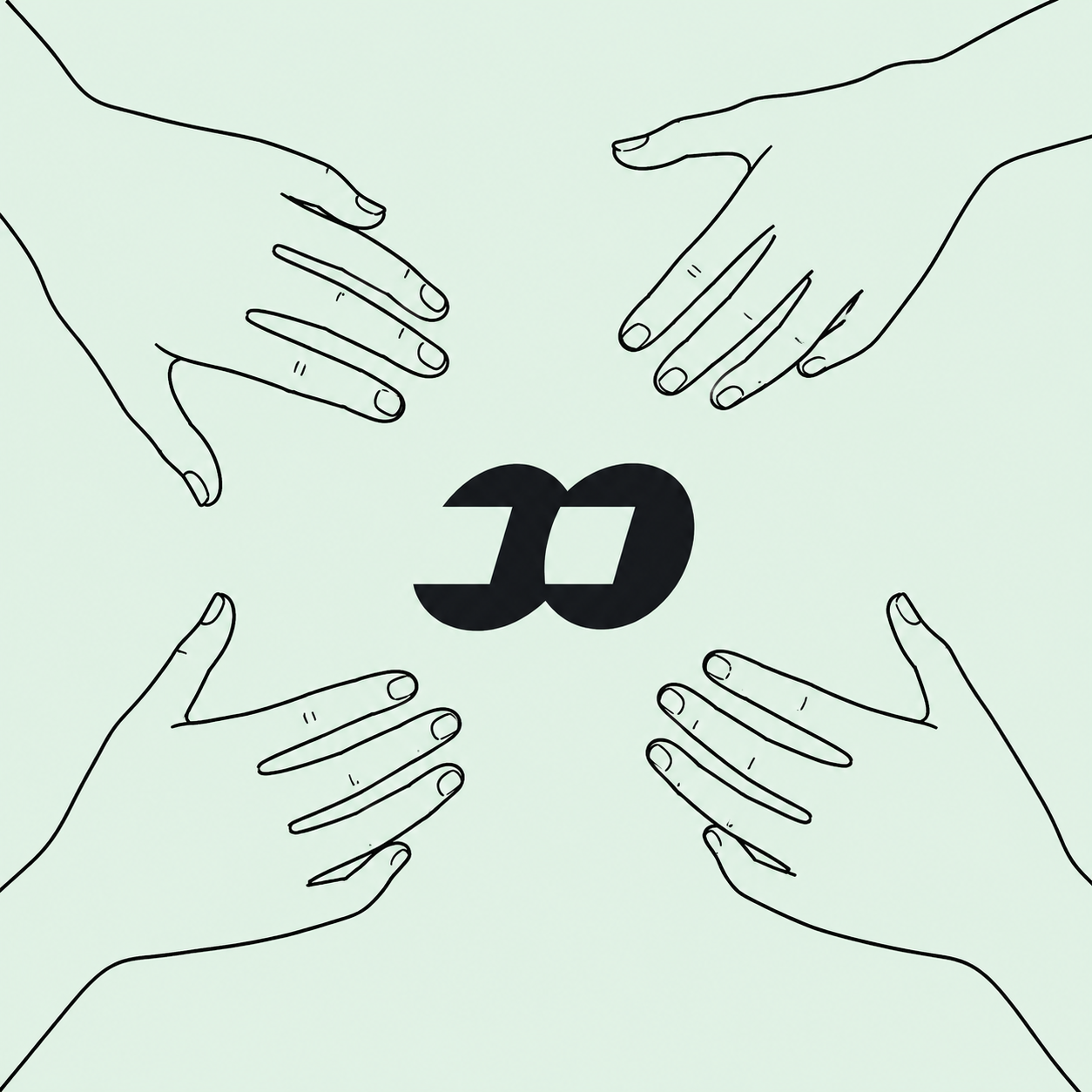
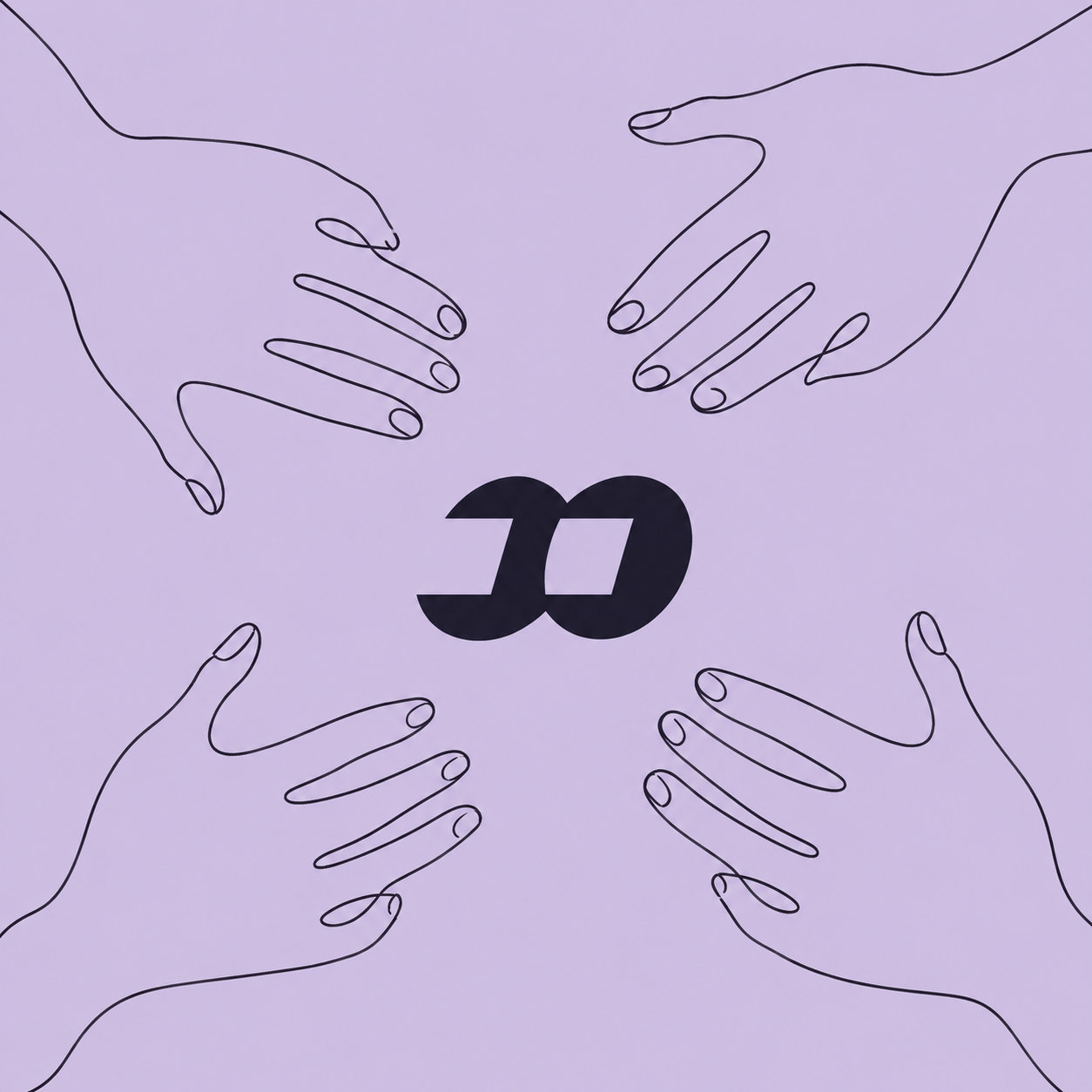
The site now follows the artwork: warm paper, black ink, imperfect outlines and soft pastel fields. No loud effects competing with the images.
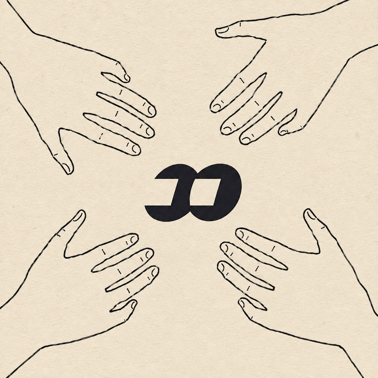
Fair launch energy. A visual identity that feels immediate, recognizable and easy to share.
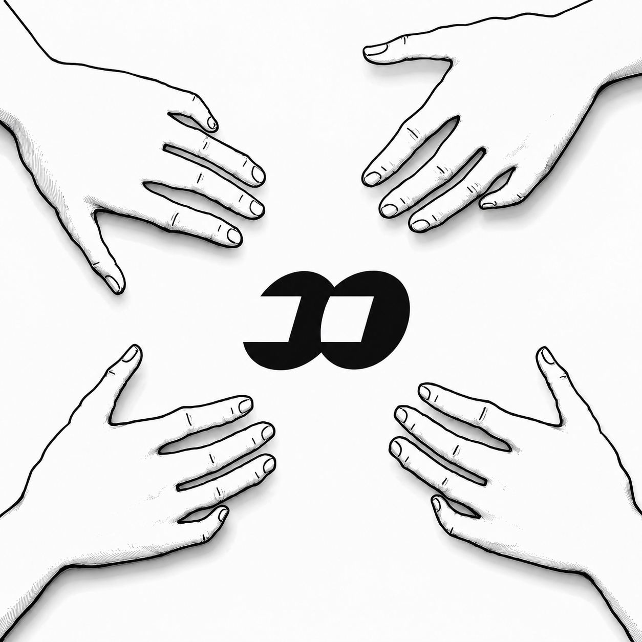
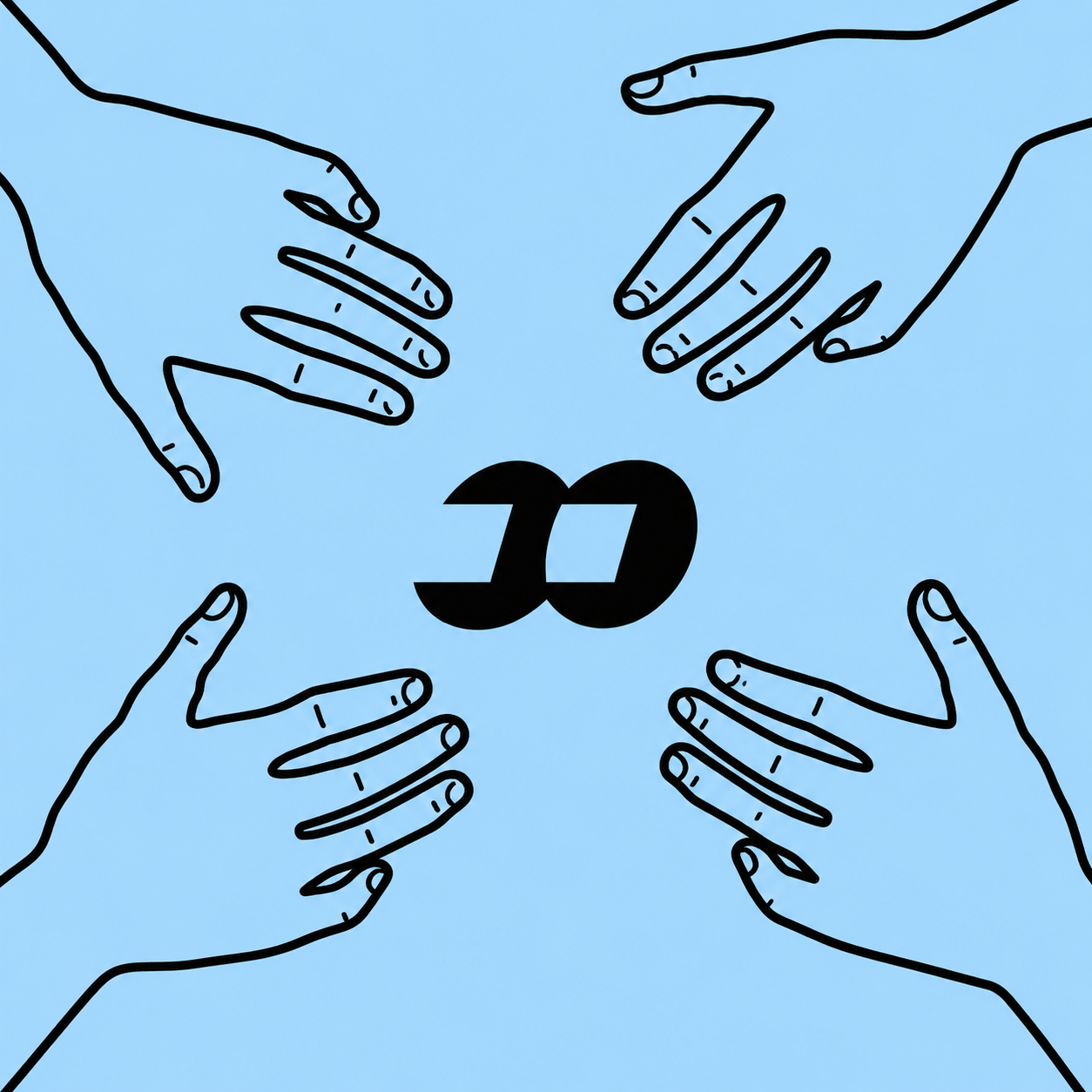
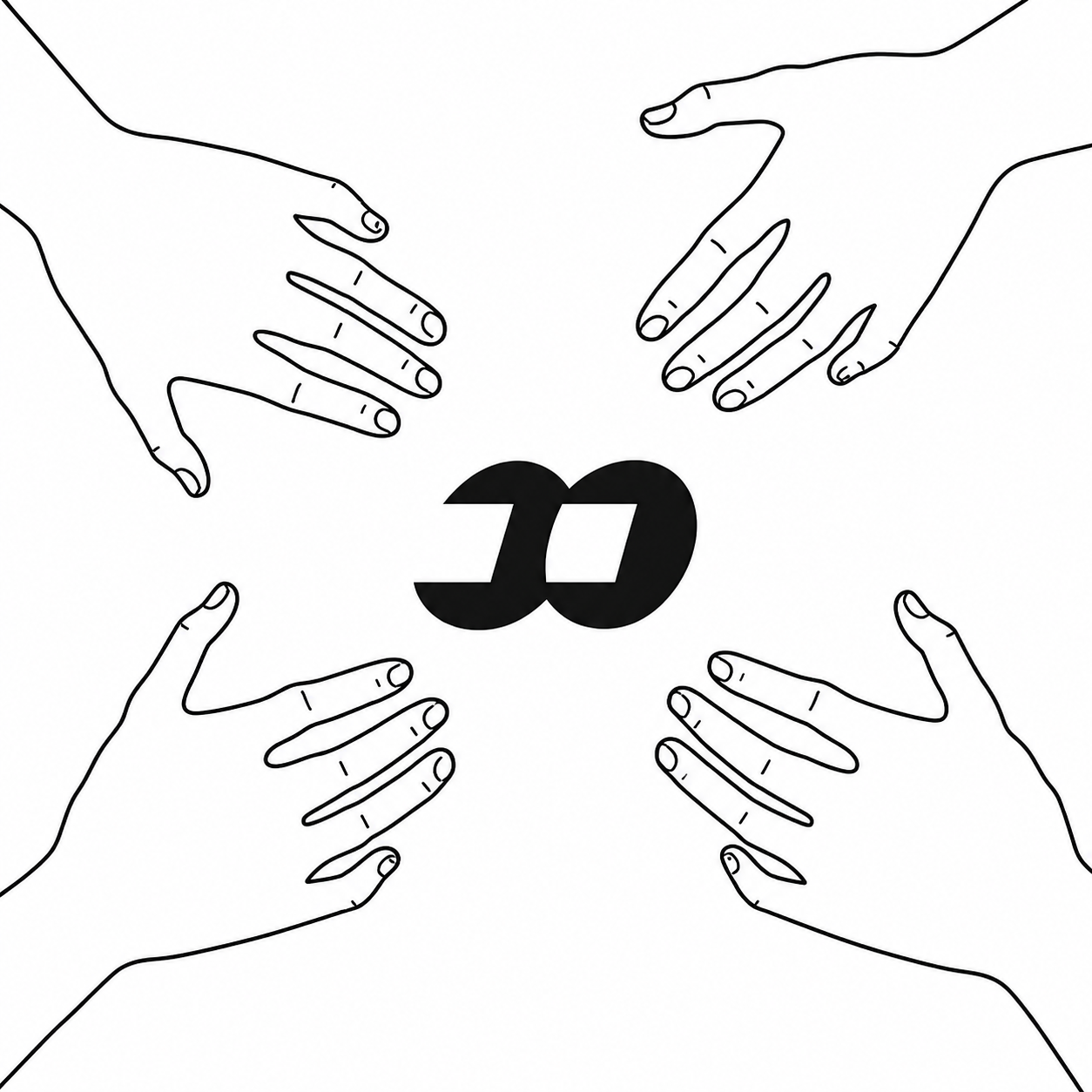
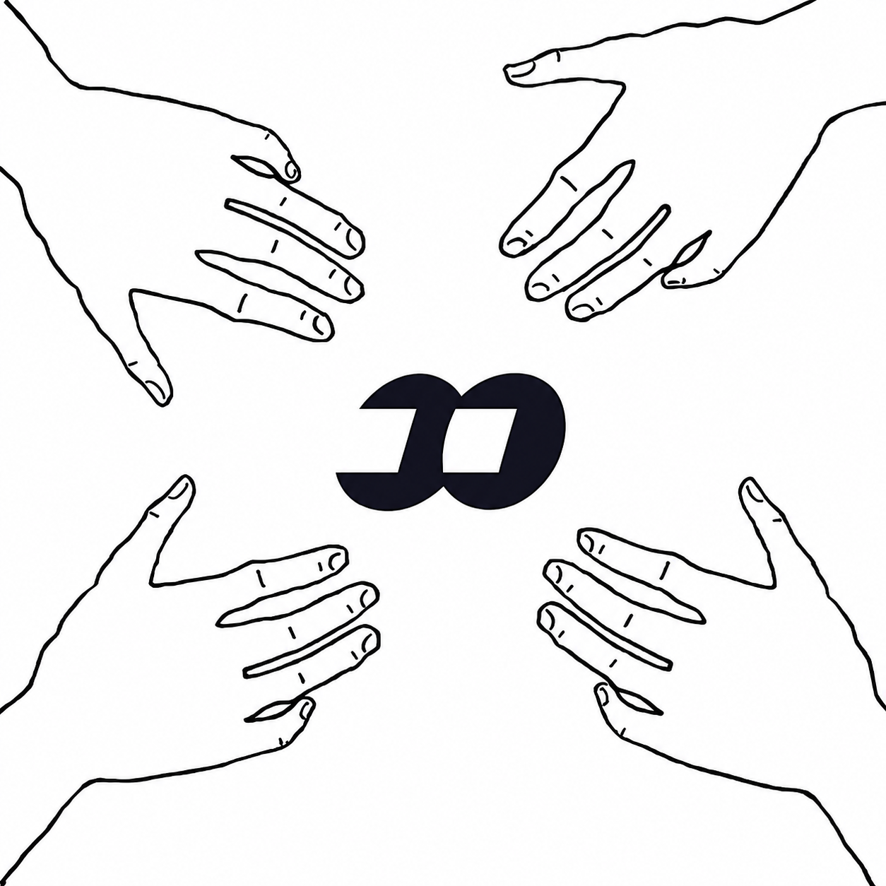
Four hands, one center. The entire community points toward the same symbol.
Square compositions, clean contrast and a palette made for posts, banners and token pages.
Every image from the project is included below. The asymmetric grid follows the loose, handmade composition of the drawings.
The Dexscreener frame stays dark so the chart reads clearly while the rest of the site keeps the hand-drawn paper style.
Follow the project, enter the community and keep the symbol moving across the timeline.